
Color, or colour, is the characteristic of visual perception described through color categories, with names such as red, orange, yellow, green, blue, or purple. This perception of color derives from the stimulation of photoreceptor cells by electromagnetic radiation. Color categories and physical specifications of color are associated with objects through the wavelengths of the light that is reflected from them and their intensities. This reflection is governed by the object's physical properties such as light absorption, emission spectra, etc.
In color theory, hue is one of the main properties of a color, defined technically as "the degree to which a stimulus can be described as similar to or different from stimuli that are described as red, orange, yellow, green, blue, purple".

The Natural Color System (NCS) is a proprietary perceptual color model. It is based on the color opponency hypothesis of color vision, first proposed by German physiologist Ewald Hering. The current version of the NCS was developed by the Swedish Colour Centre Foundation, from 1964 onwards. The research team consisted of Anders Hård, Lars Sivik and Gunnar Tonnquist, who in 1997 received the AIC Judd award for their work. The system is based entirely on the phenomenology of human perception and not on color mixing. It is illustrated by a color atlas, marketed by NCS Colour AB in Stockholm.
HSL and HSV are alternative representations of the RGB color model, designed in the 1970s by computer graphics researchers to more closely align with the way human vision perceives color-making attributes. In these models, colors of each hue are arranged in a radial slice, around a central axis of neutral colors which ranges from black at the bottom to white at the top.
In computing, on the X Window System, X11 color names are represented in a simple text file, which maps certain strings to RGB color values. It was traditionally shipped with every X11 installation, hence the name, and is usually located in <X11root>/lib/X11/rgb.txt. The web colors list is descended from it but differs for certain color names.
In the visual arts, color theory is a body of practical guidance to color mixing and the visual effects of a specific color combination. There are also definitions of colors based on the color wheel: primary color, secondary color, and tertiary color. Although color theory principles first appeared in the writings of Leone Battista Alberti and the notebooks of Leonardo da Vinci, a tradition of "colory theory" began in the 18th century, initially within a partisan controversy over Isaac Newton's theory of color and the nature of primary colors. From there it developed as an independent artistic tradition with only superficial reference to colorimetry and vision science.
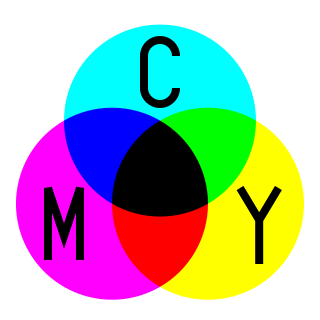
Subtractive color, or "subtractive color mixing", predicts the spectral power distribution of light after it passes through successive layers of partially absorbing media. This idealized model is the essential principle of how dyes and inks are used in color printing and photography where the perception of color is elicited after white light passes through microscopic "stacks" of partially absorbing media allowing some wavelengths of light to reach the eye and not others.

A color wheel or color circle is an abstract illustrative organization of color hues around a circle, which shows the relationships between primary colors, secondary colors, tertiary colors etc.
A color model is an abstract mathematical model describing the way colors can be represented as tuples of numbers, typically as three or four values or color components. When this model is associated with a precise description of how the components are to be interpreted, the resulting set of colors is called "color space." This section describes ways in which human color vision can be modeled.

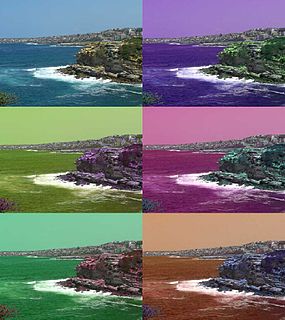
In color theory, a color scheme is the choice of colors used in various artistic and design contexts. For example, the "Achromatic" use of a white background with black text is an example of a basic and commonly default color scheme in web design.
A color solid is the three-dimensional representation of a color model, an analog of the two-dimensional color wheel. The added spatial dimension allows a color solid to depict an added dimension of color variation. Whereas a two-dimensional color wheel typically depicts the variables of hue and lightness, a color solid adds the variable of colorfulness, allowing the solid to depict all conceivable colors in an organized three-dimensional structure.

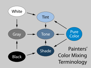
Varieties of the color red may differ in hue, chroma or lightness, or in two or three of these qualities. Variations in value are also called tints and shades, a tint being a red or other hue mixed with white, a shade being mixed with black. A large selection of these various colors is shown below.
Blend modes in digital image editing and computer graphics are used to determine how two layers are blended with each other. The default blend mode in most applications is simply to obscure the lower layer by covering it with whatever is present in the top layer. However, as each pixel has a numerical representation, there exist a large number of ways to blend two layers.
There are two types of color mixing: additive and subtractive. In both cases, mixing is typically described in terms of three colorand three secondary colors. All primary colors combined make an orange/brown shade.
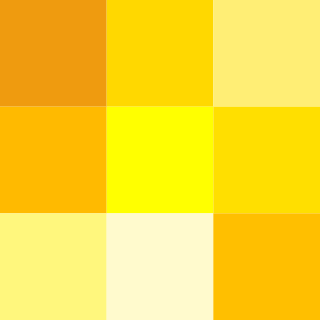
Varieties of the color yellow may differ in hue, chroma or lightness, or in two or three of these qualities. Variations in value are also called tints and shades, a tint being a yellow or other hue mixed with white, a shade being mixed with black. A large selection of these various colors is shown below.

Varieties of the color blue may differ in hue, chroma, or lightness, or in two or three of these qualities. Variations in value are also called tints and shades, a tint being a blue or other hue mixed with white, a shade being mixed with black. A large selection of these various colors is shown below.
This article provides introductory information about the RGB, HSV, and HSL color models from a computer graphics perspective. An introduction to colors is also provided to support the main discussion.
The Color Naming System (CNS) is a systematic notation for named colors for computer applications using English terms created by Berk et al. in 1982.


