In painting, local color is the color of an object when seen under flat white light with no adjustment for form shadow or colors of light or secondary light sources. An example would be the assumption that an apple is "red" when it is actually dependent on the color of the light hitting it, color of objects around it, glossiness, and variations within the colors on the surface of the apple itself. Local color is learned in childhood to help simplify and make sense of the world. Coloring books reinforce the idea of simplifying colors. "The sky is blue", "grass is green", etc. when there are actually myriad variations in hue, chroma, within these areas. In order to represent objects realistically, painters must look beyond the simplifications of local color. Demonstrations of color constancy show how flawed local color assumptions can be when the light source has a color shift.
In contemporary sculpture local color is the original color of the raw material that remains unpainted in the completed work.
Color or colour is the visual perceptual property deriving from the spectrum of light interacting with the photoreceptor cells of the eyes. Color categories and physical specifications of color are associated with objects or materials based on their physical properties such as light absorption, reflection, or emission spectra. By defining a color space colors can be identified numerically by their coordinates.
Color temperature is the color of light emitted by an idealized opaque, non-reflective body at a particular temperature measured in kelvins. The color temperature scale is used to categorize the color of light emitted by other light sources regardless of their temperature.
The RGB color model is an additive color model in which the red, green, and blue primary colors of light are added together in various ways to reproduce a broad array of colors. The name of the model comes from the initials of the three additive primary colors, red, green, and blue.
The visible spectrum is the portion of the electromagnetic spectrum that is visible to the human eye. Electromagnetic radiation in this range of wavelengths is called visible light or simply light. A typical human eye will respond to wavelengths from about 380 to about 750 nanometers. In terms of frequency, this corresponds to a band in the vicinity of 400–790 terahertz. These boundaries are not sharply defined and may vary per individual. Under optimal conditions these limits of human perception can extend to 310 nm (ultraviolet) and 1100 nm. The optical spectrum is sometimes considered to be the same as the visible spectrum, but some authors define the term more broadly, to include the ultraviolet and infrared parts of the electromagnetic spectrum as well.
In colorimetry, metamerism is a perceived matching of colors with different (nonmatching) spectral power distributions. Colors that match this way are called metamers.
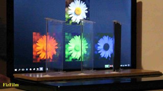
Color constancy is an example of subjective constancy and a feature of the human color perception system which ensures that the perceived color of objects remains relatively constant under varying illumination conditions. A green apple for instance looks green to us at midday, when the main illumination is white sunlight, and also at sunset, when the main illumination is red. This helps us identify objects.
Shading refers to the depiction of depth perception in 3D models or illustrations by varying the level of darkness. Shading tries to approximate local behavior of light on the object's surface and is not to be confused with techniques of adding shadows, such as shadow mapping or shadow volumes, which fall under global behavior of light.
QuickDraw is the 2D graphics library and associated Application Programming Interface (API) which is a core part of the classic Mac OS operating system. It was initially written by Bill Atkinson and Andy Hertzfeld. QuickDraw still existed as part of the libraries of Mac OS X, but had been largely superseded by the more modern Quartz graphics system. In Mac OS X v10.4, QuickDraw has been officially deprecated. In Mac OS X v10.5 applications using QuickDraw cannot make use of the added 64-bit support. In Mac OS X v10.8, QuickDraw header support was removed from the operating system. Applications using QuickDraw will still run under OS X 10.8 through macOS 10.13; however, the current versions of Xcode and the macOS SDK do not contain the header files to compile such programs.
A monochromic image is composed of one color. The term monochrome comes from Ancient Greek μόνος (mónos) 'one', and χρῶμα (khrôma) 'color'.
Color vision, a feature of visual perception, is an ability to perceive differences between light composed of different wavelengths independently of light intensity. Color perception is a part of the larger visual system and is mediated by a complex process between neurons that begins with differential stimulation of different types of photoreceptors by light entering the eye. Those photoreceptors then emit outputs that are propagated through many layers of neurons and then ultimately to the brain. Color vision is found in many animals and is mediated by similar underlying mechanisms with common types of biological molecules and a complex history of evolution in different animal taxa. In primates, color vision may have evolved under selective pressure for a variety of visual tasks including the foraging for nutritious young leaves, ripe fruit, and flowers, as well as detecting predator camouflage and emotional states in other primates.
Chromatic adaptation is the human visual system’s ability to adjust to changes in illumination in order to preserve the appearance of object colors. It is responsible for the stable appearance of object colors despite the wide variation of light which might be reflected from an object and observed by our eyes. A chromatic adaptation transform (CAT) function emulates this important aspect of color perception in color appearance models.
In color reproduction, including computer graphics and photography, the gamut, or color gamut, is a certain complete subset of colors. The most common usage refers to the subset of colors which can be accurately represented in a given circumstance, such as within a given color space or by a certain output device.
Color photography is photography that uses media capable of capturing and reproducing colors. By contrast, black-and-white or gray-monochrome photography records only a single channel of luminance (brightness) and uses media capable only of showing shades of gray.
In the visual arts, color theory is a body of practical guidance to color mixing and the visual effects of a specific color combination. Color terminology based on the color wheel and its geometry separates colors into primary color, secondary color, and tertiary color. Understanding color theory dates to antiquity. Aristotle and Claudius Ptolemy already discussed which and how colors can be produced by mixing other colors. The influence of light on color was investigated and revealed further by al-Kindi and Ibn al-Haytham (d.1039). Ibn Sina, Nasir al-Din al-Tusi and Robert Grosseteste discovered that contrary to the teachings of Aristotle, there are multiple color paths to get from black to white. More modern approaches to color theory principles can be found in the writings of Leone Battista Alberti and the notebooks of Leonardo da Vinci. A formalization of "color theory" began in the 18th century, initially within a partisan controversy over Isaac Newton's theory of color and the nature of primary colors. From there it developed as an independent artistic tradition with only superficial reference to colorimetry and vision science.
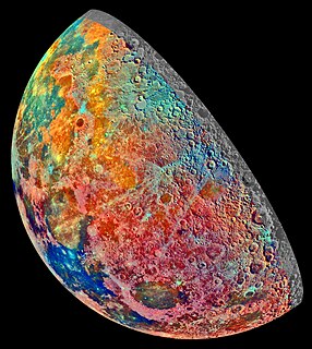
False color refers to a group of color rendering methods used to display images in color which were recorded in the visible or non-visible parts of the electromagnetic spectrum. A false-color image is an image that depicts an object in colors that differ from those a photograph would show. In this image, colors have been assigned to three different wavelengths that our eyes cannot normally see.
The term composition means "putting together". It can be thought of as the organization of the elements of art according to the principles of art. Composition can apply to any work of art, from music through writing and into photography, that is arranged using conscious thought.
The CIE 1931 color spaces are the first defined quantitative links between distributions of wavelengths in the electromagnetic visible spectrum, and physiologically perceived colors in human color vision. The mathematical relationships that define these color spaces are essential tools for color management, important when dealing with color inks, illuminated displays, and recording devices such as digital cameras. The system was designed in 1931 by the "Commission Internationale de l'éclairage", known in English as the International Commission on Illumination.
Candy apple red is the name code used by manufacturing companies to define a shade of red similar to the red sugar coating on candied apples. The typical method for producing a candy apple finish is to apply a metallic base-coat, followed by a translucent color coat. A final clear coat adds additional gloss.
Color realism is a fine art style where accurately portrayed colors create a sense of space and form. It employs a flattening of objects into areas of color, where the modulations occur more as a result of an object interacting with the color and light of its environment than the sculptural modeling of form or presentation of textural detail. The actual color of an object, or 'local color', is held secondary to how that color interacts with surrounding light sources that may alter the look of the original color. Warm light of the sun, cool light from the sky, and warm reflected light bouncing off other objects are all examples of how a local color may be affected by its location in space.
Shades of chartreuse are listed below. Historically, many of these colors have gone under the name of either yellow or green, as the specifics of their color composition was not known until later.
This page is based on this Wikipedia article Text is available under the CC BY-SA 4.0 license; additional terms may apply. Images, videos and audio are available under their respective licenses.