
Palatino is the name of an old-style serif typeface designed by Hermann Zapf, initially released in 1949 by the Stempel foundry and later by other companies, most notably the Mergenthaler Linotype Company.
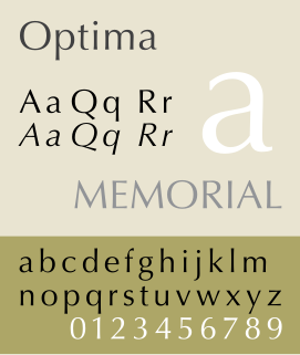
Optima is a humanist sans-serif typeface designed by Hermann Zapf and released by the D. Stempel AG foundry, Frankfurt, West Germany in 1958.

A typeface is the design of lettering that can include variations in size, weight, slope, width, and so on. Each of these variations of the typeface is a font.

Helvetica is a widely used sans-serif typeface developed in 1957 by Swiss typeface designer Max Miedinger and Eduard Hoffmann.
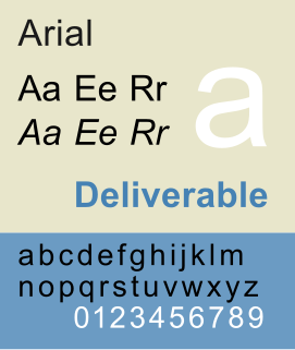
Arial is a sans-serif typeface and set of computer fonts in the neo-grotesque style. Fonts from the Arial family are included with all versions of Microsoft Windows from Windows 3.1 on, some other Microsoft software applications, Apple's macOS and many PostScript 3 computer printers. The typeface was designed in 1982, by Robin Nicholas and Patricia Saunders, for Monotype Typography. Each of its characters has the same width as that character in the popular typeface Helvetica; the purpose of this design is to allow a document designed in Helvetica to be displayed and printed with the intended line-breaks and page-breaks without a Helvetica license. Because of their almost identical appearances, both Arial and Helvetica have commonly been mistaken for one another.

In typography, emphasis is the strengthening of words in a text with a font in a different style from the rest of the text, to highlight them. It is the equivalent of prosody stress in speech.

Univers is the name of a large sans-serif typeface family designed by Adrian Frutiger and released by his employer Deberny & Peignot in 1957. Classified as a neo-grotesque sans-serif, one based on the model of nineteenth-century German typefaces such as Akzidenz-Grotesk, it was notable for its availability from the moment of its launch in a comprehensive range of weights and widths. The original marketing for Univers deliberately referenced the periodic table to emphasise its scope.
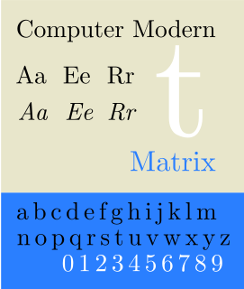
Computer Modern is the original family of typefaces used by the typesetting program TeX. It was created by Donald Knuth with his Metafont program, and was most recently updated in 1992. Computer Modern, or variants of it, remains very widely used in scientific publishing, especially in disciplines that make frequent use of mathematical notation.
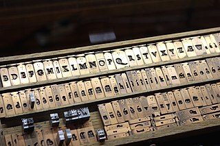
In the manufacture of metal type used in letterpress printing, a matrix is the mould used to cast a letter, known as a sort. Matrices for printing types were made of copper.

Lucida is an extended family of related typefaces designed by Charles Bigelow and Kris Holmes and released from 1984 onwards. The family is intended to be extremely legible when printed at small size or displayed on a low-resolution display – hence the name, from 'lucid'.
Oblique type is a form of type that slants slightly to the right, used for the same purposes as italic type. Unlike italic type, however, it does not use different glyph shapes; it uses the same glyphs as roman type, except slanted. Oblique and italic type are technical terms to distinguish between the two ways of creating slanted font styles; oblique designs may be labelled italic by companies selling fonts or by computer programs. Oblique designs may also be called slanted or sloped roman styles. Oblique fonts, as supplied by a font designer, may be simply slanted, but this is often not the case: many have slight corrections made to them to give curves more consistent widths, so they retain the proportions of counters and the thick-and-thin quality of strokes from the regular design.

In typography, a slab serif typeface is a type of serif typeface characterized by thick, block-like serifs. Serif terminals may be either blunt and angular (Rockwell), or rounded (Courier). Slab serifs were introduced in the early nineteenth century.
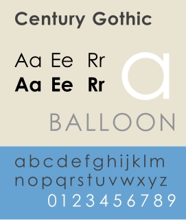
Century Gothic is a digital sans-serif typeface in the geometric style, released by Monotype Imaging in 1991. It is a redrawn version of Monotype's own Twentieth Century, a copy of Bauer's Futura, to match the widths of ITC Avant Garde Gothic. It is an exclusively digital typeface that has never been manufactured as metal type.

Didone is a genre of serif typeface that emerged in the late 18th century and was the standard style of general-purpose printing during the nineteenth. It is characterized by:

In metal typesetting, a font is a particular size, weight and style of a typeface. Each font is a matched set of type, with a piece for each glyph. A typeface consists of a range of such fonts that shared an overall design.
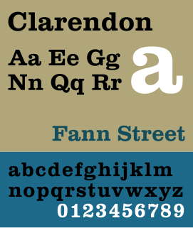
Clarendon is the name of a slab-serif typeface that was released in 1845 by Thorowgood and Co. of London, a letter foundry often known as the Fann Street Foundry. The original Clarendon design is credited to Robert Besley, a partner in the foundry, and was originally engraved by punchcutter Benjamin Fox, who may also have contributed to its design. Many copies, adaptations and revivals have been released, becoming almost an entire genre of type design.

Rotis is a typeface developed in 1988 by Otl Aicher, a German graphic designer and typographer. In Rotis, Aicher explores an attempt at maximum legibility through a highly unified yet varied typeface family that ranges from full serif, glyphic, and sans-serif. The four basic Rotis variants are:

Syntax comprises a family of fonts designed by Swiss typeface designer Hans Eduard Meier. Originally just a sans-serif font, it was extended with additional serif designs.
Typeface anatomy describes the graphic elements that make up letters in a typeface.

A reverse-contrast or reverse-stress letterform is a design in which the stress is reversed from the norm: a typeface or custom lettering where the horizontal lines are the thickest. This is the reverse of the vertical lines being the same width or thicker than horizontals, which is normal in Latin-alphabet writing and especially printing. The result is a dramatic effect, in which the letters seem to have been printed the wrong way round. The style invented in the early nineteenth century as attention-grabbing novelty display designs. Modern font designer Peter Biľak, who has created a design in the genre, has described them as "a dirty trick to create freakish letterforms that stood out."
