Graphic design is a profession, academic discipline and applied art whose activity consists in projecting visual communications intended to transmit specific messages to social groups, with specific objectives. Graphic design is an interdisciplinary branch of design and of the fine arts. Its practice involves creativity, innovation and lateral thinking using manual or digital tools, where it is usual to use text and graphics to communicate visually.

Typography is the art and technique of arranging type to make written language legible, readable and appealing when displayed. The arrangement of type involves selecting typefaces, point sizes, line lengths, line spacing, letter spacing, and spaces between pairs of letters. The term typography is also applied to the style, arrangement, and appearance of the letters, numbers, and symbols created by the process. Type design is a closely related craft, sometimes considered part of typography; most typographers do not design typefaces, and some type designers do not consider themselves typographers. Typography also may be used as an ornamental and decorative device, unrelated to the communication of information.
Web design encompasses many different skills and disciplines in the production and maintenance of websites. The different areas of web design include web graphic design; user interface design ; authoring, including standardised code and proprietary software; user experience design ; and search engine optimization. Often many individuals will work in teams covering different aspects of the design process, although some designers will cover them all. The term "web design" is normally used to describe the design process relating to the front-end design of a website including writing markup. Web design partially overlaps web engineering in the broader scope of web development. Web designers are expected to have an awareness of usability and be up to date with web accessibility guidelines.

A typeface is a design of letters, numbers and other symbols, to be used in printing or for electronic display. Most typefaces include variations in size, weight, slope, width, and so on. Each of these variations of the typeface is a font.

Lorem ipsum is a dummy or placeholder text commonly used in graphic design, publishing, and web development to fill empty spaces in a layout that does not yet have content.
OpenType is a format for scalable computer fonts. Derived from TrueType, it retains TrueType's basic structure but adds many intricate data structures for describing typographic behavior. OpenType is a registered trademark of Microsoft Corporation.
Graphics are visual images or designs on some surface, such as a wall, canvas, screen, paper, or stone, to inform, illustrate, or entertain. In contemporary usage, it includes a pictorial representation of data, as in design and manufacture, in typesetting and the graphic arts, and in educational and recreational software. Images that are generated by a computer are called computer graphics.
Placeholder may refer to:

A category of fine art, graphic art covers a broad range of visual artistic expression, typically two-dimensional graphics, i.e. produced on a flat surface, today normally paper or a screen on various electronic devices. The term usually refers to the arts that rely more on line, color or tone, especially drawing and the various forms of engraving; it is sometimes understood to refer specifically to drawing and the various printmaking processes, such as line engraving, aquatint, drypoint, etching, mezzotint, monotype, lithography, and screen printing. Graphic art mostly includes calligraphy, photography, painting, typography, computer graphics, and bindery. It also encompasses drawn plans and layouts for interior and architectural designs.
In word processing and digital typesetting, a non-breaking space, also called NBSP, required space, hard space, or fixed space, is a space character that prevents an automatic line break at its position. In some formats, including HTML, it also prevents consecutive whitespace characters from collapsing into a single space. Non-breaking space characters with other widths also exist.

Infographic are graphic visual representations of information, data, or knowledge intended to present information quickly and clearly. They can improve cognition by using graphics to enhance the human visual system's ability to see patterns and trends. Similar pursuits are information visualization, data visualization, statistical graphics, information design, or information architecture. Infographics have evolved in recent years to be for mass communication, and thus are designed with fewer assumptions about the readers' knowledge base than other types of visualizations. Isotypes are an early example of infographics conveying information quickly and easily to the masses.

A website wireframe, also known as a page schematic or screen blueprint, is a visual guide that represents the skeletal framework of a website. The term wireframe is taken from other fields that use a skeletal framework to represent 3-dimensional shape and volume. Wireframes are created for the purpose of arranging elements to best accomplish a particular purpose. The purpose is usually driven by a business objective and a creative idea.

In graphic design, page layout is the arrangement of visual elements on a page. It generally involves organizational principles of composition to achieve specific communication objectives.

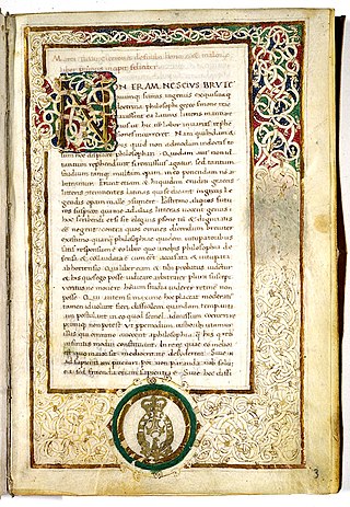
In a written or published work, an initial is a letter at the beginning of a word, a chapter, or a paragraph that is larger than the rest of the text. The word is ultimately derived from the Latin initiālis, which means of the beginning. An initial is often several lines in height, and, in older books or manuscripts, may take the form of an inhabited or historiated initial. Certain important initials, such as the Beatus initial, or B, of Beatus vir... at the opening of Psalm 1 at the start of a vulgate Latin. These specific initials in an illuminated manuscript were also called initia.
Filler text is text that shares some characteristics of a real written text, but is random or otherwise generated. It may be used to display a sample of fonts, generate text for testing, or to spoof an e-mail spam filter. The process of using filler text is sometimes called greeking, although the text itself may be nonsense, or largely Latin, as in Lorem ipsum.

Graphic communication as the name suggests is communication using graphic elements. These elements include symbols such as glyphs and icons, images such as drawings and photographs, and can include the passive contributions of substrate, colour and surroundings. It is the process of creating, producing, and distributing material incorporating words and images to convey data, concepts, and emotions.
The zero-width space (), abbreviated ZWSP, is a non-printing character used in computerized typesetting to indicate where the word boundaries are, without actually displaying a visible space in the rendered text. This enables text-processing systems for scripts that do not use explicit spacing to recognize where word boundaries are for the purpose of handling line breaks appropriately.
In graphic design and printing, the phrases for position only or for placement only, or the initialism FPO, indicate materials that have been used as placeholders in a layout prior to it being declared finished and ready for publication.
DirectWrite is a text layout and glyph rendering API by Microsoft. It was designed to replace GDI/GDI+ and Uniscribe for screen-oriented rendering and was first shipped with Windows 7 and Windows Server 2008 R2, as well as Windows Vista and Windows Server 2008. DirectWrite is hardware-accelerated when running on top of Direct2D, but can also use the CPU to render on any target, including a GDI bitmap.
De finibus bonorum et malorum is a Socratic dialogue by the Roman orator, politician, and Academic Skeptic philosopher Marcus Tullius Cicero. It consists of three dialogues, over five books, in which Cicero discusses the philosophical views of Epicureanism, Stoicism, and the Platonism of Antiochus of Ascalon. The treatise is structured so that each philosophical system is described in its own book, and then disputed in the following book. The book was developed in the summer of the year 45 BC, and was written over the course of about one and a half months. Together with the Tusculanae Quaestiones written shortly afterwards and the Academica, De finibus bonorum et malorum is one of the most extensive philosophical works of Cicero.
