This is a list of torch designs used to carry the Olympic flame at the Olympic Games.
Games | Host | Design | Designer(s) | Manufacturer | Length (cm) | Weight (g) | Numbers produced | Image | Ref |
---|---|---|---|---|---|---|---|---|---|
1936 | Berlin, Germany | Walter Lemcke and Peter Wolf | Friedrich Krupp AG | 27 | 450 | 3,840 | [1] | ||
1948 | London, Great Britain | Ralph Lavers | 47 | 960 | 1,688 [lower-alpha 1] | [2] | |||
1952 | Helsinki, Finland | Aukusti Tuhka | Kultakeskus Oy, Hämeenlinna | 60 | 600 | 22 | [3] | ||
1956 | Melbourne, Australia | Ralph Lavers | 47 | 960 | 400 [lower-alpha 1] | [4] | |||
1960 | Rome, Italy | The torch was designed to bring back the traditions of the antique torches of Ancient Rome. It was made from aluminum and covered with bronze. Weighing a total of 580 grams, it was one of the lightest torches. | Pier Luigi Nervi and Amedeo Maiuri | Curtisa, Bologna | 40 | 580 | c. 1,500 | [5] | |
1964 | Tokyo, Japan | The minimalistic design of the torch was dedicated to the trends which were in fashion in the sixties. With a handle separated from the 'shaft' of the torch by a round sword, it resembled a fencing sword. | Sori Yanagi | 64.5 | 836 | 5,244 | [6] [7] | ||
1968 | Mexico City, Mexico | The torch resembles a potato masher with the words Mexico 68 on the top. The size of this torch was all of 52 cm. | James Metcalfe | 52.3 | 780 | 3,000 [lower-alpha 2] | | [8] | |
1972 | Munich, Germany | The Olympic rings with the text "'München 1972 Spiele der XX. Olympiade'" on the handle. The logo on the upper surface of the plate. The entire surface of the torch is completely nickel-plated. It resembles a top and a sword. The logo represents the sun, the moon and the stars. A liquid gas was used for the burning. | Hagri Kettwig | Friedrich Krupp AG | 75 | 1350 | 5,917 | [9] | |
1976 | Montreal, Canada | The torch was primarily made of aluminium and weighed 836 grams. It was fuelled by olive oil in part to further strengthen the link to the Greek origins of the events. This torch resembles a microphone. The holes represents the aboriginals of Canada. Red represents Canada and the ethnic groups of the country. | Georges Huel and Michel Daillaire | Queensway Machine Products | 66 | 836 | 1,250 [lower-alpha 3] | [10] | |
1980 | Moscow, Soviet Union | The Olympic torch resembles a comet. The colors represents the four seasons. White represents the Autumn and Winter. Gold represents Spring and Summer. It has the words Москва-Олимпиада-80 on the white and the logo on the golden protective cover. Eventually the torch was "polished". In the USSR, a patent of invention was registered for the torch with the number 729414. | Boris Tutschin | Leningrad Department of the Ministry of Aircraft Production | 56.5 | 700 | 5,000 [lower-alpha 1] | [11] | |
1984 | Los Angeles, U.S. | It resembles a blueprint. Etched on the ring of the torch were the words of the Olympic motto ("Citius, Altius, Fortius") with the Olympic rings between each word. It features the plaque of the Los Angeles Memorial Coliseum and the 1932 Summer Olympics Cauldron who was being lited again. | Turner Industries | 56.5 | 1,000 | 4,500 | [12] | ||
1988 | Seoul, South Korea | The design of the torch, engraved with two dragons symbolizing the harmony of East and West. Korean traditions were taken into account in the making of the entire external appearance of the torch. The unique character of the torch is in the leather sheath of the handle. | Lee Woo-Sung | Korea Explosive Co. Ltd (Hanwha Corporation) | 50.5 | 1,000 | 3,300 | [13] | |
1992 | Barcelona, Spain | It resembles a flower pot and a cauldron. It has the words XXV Olimpiada Barcelona 1992 and the logo. | André Ricard Sala | Kromschröder | 68 | 1,200 | 9,444 [lower-alpha 4] | [14] | |
1996 | Atlanta, U.S. | It resembles a Greek column. It features 22 aluminum "reeds" intended to represent the number of times that the Games had been held. A gold-plated band towards the base of the torch features the names of all 20 host cities up to and including Atlanta while the logo is etched into another band near the top. The handle, made of Georgia hardwood, is found near the center of the 76 centimetres (30 in) torch. | Peter Mastrogiannis, Malcolm Grear Designers | 76 | 1,600 | 17,000 | [15] | ||
2000 | Sydney, Australia | The design of the Olympic and torch reflected three famed areas of Australian culture: the boomerang, the Sydney Opera House, and the waters of the Indian and the Pacific Oceans. The concept also reflected the elements of earth, fire, and water. | Robert Jurgens | G.A. & L Harrington Pty Ltd. | 72 | 1,000 | 13,000 (est.) | [16] | |
2004 | Athens, Greece | The torch was inspired by an olive tree leaf. The design was selected to enhance the flame with its upward dynamic shape. Its ergonomic curved design establishes the torch as the continuation of the flame, which in turn rises as a continuation of the torchbearer's hand. It is made of metal (magnesium) and wood (olive tree). It also represents the fire seemed to come straight from the torchbearer's hand. | Andreas Varotsos | G.A. & L Harrington Pty Ltd. | 68 | 700 | 14,000 (est) | [17] | |
2008 | Beijing, China | It is based on traditional scrolls and uses a traditional Chinese design known as "Lucky Cloud". It designed in reference to the traditional Chinese concept of the five elements that make up the entire universe. Red is the traditional color of China. It references the yin and yang. The top of the torches represents the rivers, lakes, waterfalls, the Four Seas and the ocean of China. The bottom of the torches represents the people, animals, forests, mountains, deserts, buildings, cities, towns and villages of China. The logo is on the center of the torch. The clouds represents the ethnic minorities of the host country. It has the words Beijing 2008 on the red/maroon bottom. | A team from Lenovo Group, public Company, Beijing | Vatti Corporation Ltd | 72 | 980 | 26,440 | [18] | |
2012 | London, United Kingdom | The 2012 Olympic Torch ismade of aluminum alloy skin, perforated by 8,000 circles to represent the 8,000 torchbearers who would carry the flame. The circles also helped to dissipate heat without it being conducted down the handle, and provided extra grip. The triangular shape of torches represents the three Olympic values (respect, excellence and friendship), elements of the Olympic motto – faster, higher, stronger, Olympic Games hosted by the United Kingdom (1908, 1948 and 2012), tri-vision of the 2012 Summer Olympics (sport, education and culture). The Olympic torch is gold. | Edward Barber and Jay Osgerby | Premier Group | 80 | 800 without canister 1,090 with canister | 8,750 | [19] | |
2016 | Rio de Janeiro, Brazil | When the white torch is lit (according to the creators, known as the "kiss"), Its segments will open up. The segments come from the elements of the Brazilian flair and the host city's nature represent with the colors of the host nation's flag. The golden triangle on the top of the torch represents the three Olympic values (respect, excellence and friendship) and the achievement of the games and the sun. The green represents nature surrounding the host city. The aquamarine represents the waters surrounding the host nation and the host city. The blue represents the sea. The light blue and the shape of the segments represents the esplanades (Calçadão in Portuguese) of Copacabana and Ipanema. The axis of the torch expresses unity and diversity. | Chelles & Hayashi | Recam Laser | 69 | 1,500 | 12,000 | ||
2020 | Tokyo, Japan | The torch is made from a single sheet of medal and recycled aluminum and on top is a shape an iconic Japanese cherry blossom (sakura) flower designed to bring the Japanese people together around messages of support, acceptance and encouragement of one another, while also reflecting the Olympic flame's ability to promote peace and hope to the world. The body of the torch features five cylinders that represent petals of the beloved flower. Flames are generated from each “petal”, which are united in the centre of the torch, lighting the way with greater brilliance. A number of technological innovations are deployed in the combustion section that lights the torch, including catalytic reaction. Further building on this spirit of innovation, the torch's unique shape is made possible by utilising the same modern aluminium extrusion technology used in the manufacturing of Japan's renowned bullet trains. The construction of the torch also incorporates sustainability by using aluminium waste from temporary housing that was built in the aftermath of the Great East Japan Earthquake. While the materials were once used to help rebuild lives, they will now be used to spread a message of hope and recovery. In keeping with its vision to celebrate unity in diversity, the torch was designed to ensure ease of use for everyone. It consists of a weight and shape that is simple to grip and features a position mark to help visually impaired torchbearers identify the front of the torch. | Tokujin Yoshioka | Tokujin Yoshioka Inc. | 71.0 | 1,200 | TBA | [20] | |
2024 | Paris, France | The torch is champagne coloured. The upper portion contains a slit that allows the flame to withstand any weather condition. The lower portion is bent polish steel to represent ripples of the Seine and the water. The torch is made from recycled steel. When lit, it is design to resemble a champagne foam after a cork was popped out (this is a reference to France's wine culture). It also acts like a natural flashlight because it can reflect natural light. It is upper and lower parts also represents the unity of men and women respectively. This representation is also evident when the torch is turned symmetrically. Its curved design presents peace. | Mathieu Lehanneur | ArcelorMittal | 70.0 | 1,500 | 2,000 | [21] |
Games | Host | Design | Designer(s) | Manufacturer | Length (cm) | Weight (g) | Numbers produced | Image | Ref |
---|---|---|---|---|---|---|---|---|---|
1952 | Oslo, Norway | A map. At the "neck" of the torch, there were five Olympic rings and the inscription "Morgedal-Oslo". This torch is one of the lightest. | 22.8 | 95 | [22] | ||||
1956 | Cortina d'Ampezzo, Italy | The classic design of the torch was meant to emphasize the link with ancient Greek traditions. | 47 | 820 | 3,181 | [23] | |||
1960 | Squaw Valley, U.S. | John Hench, a Disney imagineer and designer | 48.5 | 1,320 | 23 | [24] [25] | |||
1964 | Innsbruck, Austria | The torch resembles the shape of the torches which existed in the 19th Century. The continuity of the flame burning was provided by a special content known as "Tipizir 120/140". Thanks to this, the flame was able to burn for 22 hours non-stop. | 61 | 22.0 | |||||
1968 | Grenoble, France | The torch was made from sheet copper that was covered in bronze. The knob at the end of the torch reliably shielded the torchbearers from accidental burns. It was calculated that during the torch relay, 75 tons of oil were used to maintain the flame. | 76 | 17.0 | 50,000 | ||||
1972 | Sapporo, Japan | The torch is an obvious departure from the traditions of Japanese minimalism. Sapporo's torch is rather a futuristic creation. It resembles a spaceship. The barrel with the flame with a length of 55 cm is twisted into the massive handle | Sori Yanagi | Nippon Koki Co. | 55 | 460 | 16,300 | ||
1976 | Innsbruck, Austria | The torch was decorated by a three-dimensional Olympic emblem with the five rings. There was no basin on this torch; instead, there was a wide ring below, separating the handle from the "stalk". | 74.6 | 900 | 12,00 | ||||
1980 | Lake Placid, U.S. | The torch was designed to resemble a Calla. The silver represents the New York City' skyscrapers, transportation, military and NASA. The gold represents its people, sports, agriculture and the presidents. The orange leather presents its past and the bald eagle. | 73 | 10.80 | 52 | ||||
1984 | Sarajevo, Yugoslavia | The torch was made in a minimalist style and a simple metallic tube with a handle. It resembles a satellite and a solar panel. The gold represents the Olympic spirit. While the silver represents the snow and the clouds. | Mizuno Corporation | Mizuno Corporation | 57.7 | 780 | 16,00 | ||
1988 | Calgary, Canada | Calgary Tower. It bears the motto "Citius, Altius, Fortius" and pictograms of the sports. The handle of the torch was made of maple, a tree symbolizing Canada. | 50.0 | 10.0 | 20,899 | ||||
1992 | Albertville, France | This torch resembles a horn of a bull or a flame (if turned upside down). It bears the name of the games in French, XVIes Jeux Olympiques D'Hiver Savoie France. This torch is the lightest in Olympic history. It was produced from steel with gold plating. With a height of 41 cm, it became one of the shortest torches in the history of the Games. | Philippe Starck | 41 | 13.0 | 55,000 | |||
1994 | Lillehammer, Norway | The torch is a reminder of man's mastery over fire; a flaming branch is dragged out of the fire, and as it is raised the flame travels up its length. When you run with such a branch, it burns like a flaming flag. Norwegian craftsmanship has been applied to the design of the Olympic torch. Like a sheath knife; it consists of a long wooden handle and a metal blade. The birchwood handle is the product of a long tradition in Norway, and the 'blade' of polished aluminium is a reflection of modern industry and technology. The long supple shape echoes that of the torch-bearer; the torch is more than a burning flame. The proportions are all-important: its length in relation to the human body gives it an elegance and a flow that would be lacking in a shorter torch, and torch and body together form a unit. It features the pictograms inside the metal blade. This torch is the thinnest as well as the longest. Its length was one and a half meters – almost the height of a person. The torch's handle was made from Norwegian birch, and the basin was metal. The creators of this torch came up with the poetic name "Noble" for it. | André Marandon and Paal Johan Kahrs | Paal J Kahrs Arkitekter AS | 18.4 | 12.0 | 70,000 | ||
1998 | Nagano, Japan | A taimatsu (a Japanese torch), the silver body's hexagonal form symbolizes snowflakes. It features the Nagano 1998 logo, the word "'Nagano 1998"', and the pictograms of the sports at the bottom. The top features golden Olympic Rings. | Akio Haruhara | Tokyo Katsura | 55.0 | 15.00 | 6916 | ||
2002 | Salt Lake City, U.S. | An icicle. The top section was glass, and the Olympic flame burned within the glass, echoing the 2002 Olympic theme Light the Fire Within. The glass stood for purity, winter, ice, and nature. Also inside the glass was a geometric copper structure which helped hold the flame. Copper is a very important natural element of Utah, and represented fire, warmth, Utah's History, and mirrored the orange/red colors of the theme Fire and Ice. The center section was made of silver and finished to look old and worn, while the bottom section was made of clean, highly polished silver. The center section represented the silver mining heritage of the American West, while the bottom section represented the future and modern technology. The Torchbearer gripped the torch at the junction of both the aged and polished silver, during which their hand represented a bridge from the past to the present. The two silver sections also mirrored the blue/purple colors of the Fire and Ice theme. It bears the Salt Lake City 2002 logo, the motto of the games on the silver bottom, light the fire within, the Roman numbers for the number 19, XIX and the name of the Olympic Games, Olympic Winter Games Salt Lake City 2002 with the Olympic rings in the middle. | Axiom Design | Coleman Company | 83.5 | 13.00 | 12,000 | ||
2006 | Torino, Italy | A matchstic, a ski pole, alpenstock and or a mountain peak. The 12 holes represents the Mole Antonelliana and the European Union flag. It features the Torino 2006 logo.During the relay,the torch was criticized for being too heavy. | Pininfarina | Pininfarina | 76.5 | 18.50 | 11,000 | ||
2010 | Vancouver, Canada | The lines of a skier's turns carved in the snow and the undulating beauty of Canada's winter landscape. It bears the red maple leaf in front and the motto of the games at the back, With glowing hearts/Des plus brillants exploits. It is white. The torch also represents the souls of the host city, host province and the host country. | Leo Obstbaum | Bombardier Inc. | 94.5 | 66.0 | 12,000 | ||
2014 | Sochi, Russia | a feather of a firebird. Silver in the design represented ice while the Red is the traditional colour of Russian sport and symbolizes the fire kindling in the mountains that surround the holiday resort. After the torch relays, many torchbearers complained about their weight – the torches weighed more than two kilograms. | a team of famous Russian designers and engineers | Variant-999 | 95.0 | 18.0 | 15,000 | ||
2018 | Pyeongchang, South Korea | The torch is exactly 700 mm in length, representing the altitude of Pyeongchang, which is exactly 700 meters above sea level. The white and gold tones of the torch mirror the main colours of the torch relay, while the five-pronged shape of the flame is based on the Korean symbol for the host city, which is also engraved around the bottom half and top of the torch. The color white also drew its cues from white porcelain, and also from snow and ice, two major symbols of the Winter Olympics. The five prongs form the symbol of the city, with the five-angled shape in the middle of the cap and the pentagon at the bottom representing the spirit of sports, which connects races, nations, religions, genders, cultures, as well as the five continents around the world. It will enable one part of the flame to be burning at all times, due to it being sheltered from the South Korea's strong wind and heavy snow, with an air tunnel also included to provide more oxygen to keep the flame lit. Both versions have the motto of the 2018 Olympic Games (Passion Connected) at the bottom. | Young Se Kim | Korea Explosive Co. Ltd (Hanwha Corp) | 70.0 | 7,500 | |||
2022 | Beijing, China | Taken inspiration from the Beijing 2008 cauldron and the Olympic Green as a representation of the fact that Beijing is the first city who has hosted both the Summer and Winter Olympics, the torch features patterns of clouds and snowflakes painted from the bottom up to the flame. The torch resembles two overlapping, fluttering ribbons. The red represents the flame and the white represents ice. It is the same color pallet from the 2008 torch, but with different representations. When a torchbearer passes the flame to another, it is locked to represent mutual understanding and respect between different cultures. A special torch fitted into a base served as this edition's Olympic cauldron. | Li Janye | Vatti Corporation Ltd | |||||
Games | Host | Design | Designer(s) | Manufacturer | Length (cm) | Weight (g) | Numbers produced | Image | Ref |
---|---|---|---|---|---|---|---|---|---|
1988 | Seoul, South Korea | The design is similar to the 1972 Olympic torch. | Hagri Kettwig | Friedrich Krupp AG | 75 | 1350 | [26] | ||
1992 | Barcelona, Spain | It resembles a flower pot and a cauldron. It has the words Paralímpics Barcelona 1992 and the logo. | André Ricard Sala | Kromschröder | 68 | 1,200 | [27] | ||
1996 | Atlanta, U.S. | The Paralympic torch resembles a Native American arrow. It features the logos of the Paralympics on silver top and the Paralympic taeguks on the silver arrowhead. It was the words 1996 NationsBank Paralympic Torch Relay on the wooden center. | [28] | ||||||
2000 | Sydney, Australia | The design of the Paralympic torch reflected the history, nature, cities, states and people of the host country. The design resambles the games logo . | Robert Jurgens | G.A. & L Harrington Pty Ltd. | [29] | ||||
2004 | Athens, Greece | The torch was inspired by an olive tree leaf. The design was selected to enhance the flame with its upward dynamic shape. Its ergonomic curved design establishes the torch as the continuation of the flame, which in turn rises as a continuation of the torchbearer's hand. It is made of metal (magnesium) and wood (olive tree). It also represents the fire seemed to come straight from the torchbearer's hand. This torch has the 2004 Paralympics logo. | Andreas Varotsos | G.A. & L Harrington Pty Ltd. | 68 | 700 | [27] | ||
2008 | Beijing, China | It is based on traditional scrolls and uses a traditional Chinese design known as "Lucky Cloud". It designed in reference to the traditional Chinese concept of the five elements that make up the entire universe. The torch is maroon. It references the yin and yang. The top of the torches represents the rivers, lakes, waterfalls, the Four Seas and the ocean of China. The bottom of the torches represents the people, animals, forests, mountains, deserts, buildings, cities, towns and villages of China. The logo is on the center of the torch. The clouds represents the ethnic minorities of the host country. It has the words Beijing 2008 on the red/maroon bottom. | A team from Lenovo Group, public Company, Beijing | Vatti Corporation Ltd | 72 | 980 | |||
2012 | London, United Kingdom | The Paralympic Torch are made of aluminum alloy skin, perforated by 8,000 circles to represent the 8,000 torchbearers who would carry the flame. The circles also helped to dissipate heat without it being conducted down the handle, and provided extra grip. The triangular shape of torches represents the three Paralympic values (respect, excellence and friendship), tri-vision of the Paralympics (sport, education and culture) and the Paralympic agitos, the torch received no color treatment unlike its Olympic counterpart which was painted gold as the relay happened only at the night. | Edward Barber and Jay Osgerby | Premier Group | 80 | 800 without canister 1,090 with canister | |||
2016 | Rio de Janeiro, Brazil | When the white torch is lit (according to the creators, known as the "kiss"), Its segments will open up. The segments come from the elements of the Brazilian flair and the host city's nature represent with the colors of the sun. The golden triangle on the top of the torch represents the three Paralympic values (respect, excellence and friendship), the achievement of the games, the Paralympic agitos and the sun. The gold represents nature surrounding the host city. The orange represents the waters surrounding the host nation and the host city. The red represents the sea during sunset and sunrise. The purple and the pink and the shape of the segments represents the esplanades (Calçadão in Portuguese) of Copacabana and Ipanema. The axis of the torch expresses unity and diversity. The four Paralympic values (courage, determination, inspiration and equality) are written in Braille on the Paralympic torch. | Chelles & Hayashi | Recam Laser | 69 | 1,500 | |||
2020 | Tokyo, Japan | The torch is made from a single sheet of medal and recycled aluminum and on top is a shape an iconic Japanese cherry blossom (sakura) flower designed to bring the Japanese people together around messages of support, acceptance and encouragement of one another, while also reflecting the Paralympic flame's ability to promote peace and hope to the world. The body of the torch features five cylinders that represent petals of the beloved flower. Flames are generated from each “petal”, which are united in the centre of the torch, lighting the way with greater brilliance. A number of technological innovations are deployed in the combustion section that lights the torch, including catalytic reaction. Further building on this spirit of innovation, the torch's unique shape is made possible by utilising the same modern aluminium extrusion technology used in the manufacturing of Japan's renowned bullet trains. The construction of the torch also incorporates sustainability by using aluminium waste from temporary housing that was built in the aftermath of the Great East Japan Earthquake. While the materials were once used to help rebuild lives, they will now be used to spread a message of hope and recovery. In keeping with its vision to celebrate unity in diversity, the torch was designed to ensure ease of use for everyone. It consists of a weight and shape that is simple to grip and features a position mark to help visually impaired torchbearers identify the front of the torch. It is also the same design as the Olympic torch. The difference is the torch is in sakura pink. | Tokujin Yoshioka | Tokujin Yoshioka Inc. | 71.0 | 1,200 | |||
2024 | Paris, France | The torch is the same design. | Mathieu Lehanneur | TBA |
Games | Host | Design | Designer(s) | Manufacturer | Length (cm) | Weight (g) | Numbers produced | Image | Ref |
---|---|---|---|---|---|---|---|---|---|
1998 | Nagano, Japan | The Paralympic torch has blue, red and green rings. The colors represent the colors of the taegueks. It resembles a bonshō (a Japanese bell) if turned upside down. | Akio Haruhara | image | |||||
2002 | Salt Lake City, U.S. | Is the same design used for the Olympics,a icicle. The top section was glass, and the Paralympic flame burned within the glass, echoing the 2002 Paralympic motto Mind, Body, Spirit. The glass stood for purity, winter, ice, and nature. Also inside the glass was a geometric copper structure which helped hold the flame. Copper is a very important natural element of Utah, and represented fire, warmth, Utah's History, and mirrored the orange/red colors of the theme Fire and Ice. The center section was made of silver and finished to look old and worn, while the bottom section was made of clean, highly polished silver. The center section represented the silver mining heritage of the American West, while the bottom section represented the future and modern technology. The Torchbearer gripped the torch at the junction of both the aged and polished silver, during which their hand represented a bridge from the past to the present. The two silver sections also mirrored the blue/purple colors of the Fire and Ice theme. It bears the Salt Lake City 2002 paralympic logo, the motto of the games on the silver bottom, Mind, Body and Soul, the Roman numbers for the number 8, VIII and the name of the Paralympic Games, Paralympic Winter Games Salt Lake City 2002 with the Paralympic taegeuks in the middle. | Axiom Design | Coleman Company | 83.5 | 13.00 | |||
2006 | Torino, Italy | A ski pole, alpenstock and a mountain peak. The 12 holes represents the Mole Antonelliana. It features the Torino 2006 Paralympic logo. The torch was criticized for being too heavy. | Pininfarina | Pininfarina | 76.5 | 18.50 | |||
2010 | Vancouver, Canada | A grey curved cloud and the mountains surrounding Vancouver. It bears the red maple leaf in front and the motto of the games at the back, With glowing hearts/Des plus brillants exploits. A grey version of the torch is for the Paralympic torch. The torch also represents the souls of the host city, host province and the host country. | Leo Obstbaum | Bombardier Inc. | 94.5 | 66.0 | |||
2014 | Sochi, Russia | A feather of a firebird. Silver in the design represented ice while the Sky Blue symbolizes the strength and spirit of the Paralympic Movement, the water kindling in the sea that surround the host city and the harmony, commitment and energy of the Paralympic athletes. After the torch relays, many torchbearers complained about their weight – the torches weighed more than two kilograms. | A team of famous Russian designers and engineers | Variant-999 | 95.0 | 18.0 | |||
2018 | Pyeongchang, South Korea | The torch is exactly 700 mm in length, representing the altitude of Pyeongchang, which is 700 meters above sea level. The white and bronze tones of the torch mirror the main colours of the torch relay, while the five-pronged shape of the flame is based on the Korean symbol for the host city, which is also engraved around the bottom half and top of the torch. The color white also drew its cues from white porcelain, and also from snow and ice, two major symbols of the Winter Paralympics. The five prongs form the symbol of the city, with the five-angled shape in the middle of the cap and the pentagon at the bottom representing the spirit of sports, which connects races, nations, religions, genders, cultures, as well as the five continents around the world. It will enable one part of the flame to be burning at all times, due to it being sheltered from the South Korea's strong wind and heavy snow, with an air tunnel also included to provide more oxygen to keep the flame lit. Both versions have the motto of the 2018 Paralympic Games (Passion Connected) at the bottom. The Paralympic version is bronze instead of gold and has Korean and Braille of the motto at the bottom. | Young Se Kim | Korea Explosive Co. Ltd (Hanwha Corp) | 70.0 | ||||
2022 | Beijing, China | Like the Olympic torch, it also takes inspiration from the Beijing 2008 torch as the symbolization of Beijing hosting both the Summer and Winter Paralympics, the torch features patterns of clouds and snowflakes painted from the bottom up to the flame. The torch resembles two overlapping, fluttering ribbons. The gold represents the flame and the white represents ice.The Paralympic torch version is gold as main colour, instead of red and has Braille of the name of the Winter Paralympics at the bottom. When a torchbearer passes the flame to another, it is locked to represent mutual understanding and respect between different cultures. | Li Janye | Vatti Corporation Ltd | |||||
Games | Host | Design | Designer(s) | Manufacturer | Length (cm) | Weight (g) | Numbers produced | Image | Ref |
---|---|---|---|---|---|---|---|---|---|
2010 | Singapore | Red on the top of the torch represented youths' passion and "burning desire to learn and excel, blazing the trail in life" (Blazing the Trail was the tagline of the games). White represents the sky. Water in the bottom represented Singapore, which is an island country surrounded entirely by water bodies and which had its origins as a seaport; it also reflected the "vibrant and dynamic nature" of the city-state. | Vatti Corporation Ltd | 60 | 560 | 2,400 | |||
2014 | Nanjing, China | Nicknamed the Door of Happiness. The main body of the torch is covered in the metallic luster. And the torch is extremely light. The silver-colored part is designed into the shape of letter “n”, which is the initial of the city's name, Nanjing, and is also in the shape of the city gate of the Ming Dynasty, symbolizing Nanjing's hope to present its grandeur and brilliance to the world through the games. The blue part represents the Yangtze River, the water of which passes through the gate. The gray strips at the bottom of the torch are the symbol of ripples, rendering the torch more dynamic. | Ji Ziyi | Vatti Corporation Ltd | 50 | 560 | 2,400 | ||
2018 | Buenos Aires, Argentina | According to the organizing committee, the torch is dressed in the miscellanies of the Buenos Aires 2018 emblem, inspired by the corners, icons, neighborhoods and culture of the city of Buenos Aires. In the seed of the logo burn three flames that, interlaced, give life to the Olympic flame of Youth, three, like the Olympic values of friendship, respect and excellence. | Vatti Corporation Ltd | 60 | 560 |
Games | Host | Design | Designer(s) | Manufacturer | Length (cm) | Weight (g) | Numbers produced | Image | Ref |
---|---|---|---|---|---|---|---|---|---|
2012 | Innsbruck, Austria | White represents snow and world peace. The pixels represents the soul of the countries, athletes and the people. The colors of the pixels represents each colors from the flags of the NOCs' countries. | Vatti Corporation Ltd | 60 | 560 | 2,012 | |||
2016 | Lillehammer, Norway | The blue triangles represents the ice and white represents snow. | Vatti Corporation Ltd | 60 | 560 | ||||
2020 | Lausanne, Switzerland | The torch features a blue and pink flame. | Vatti Corporation Ltd | 60 | 560 | ||||
2024 | Gangwon, South Korea | The torch is white on the top and yellow on the bottom. | Vatti Corporation Ltd | ||||||
The Paralympic Games or Paralympics, also known as the Games of the Paralympiad, is a periodic series of international multisport events involving athletes with a range of disabilities. There are Winter and Summer Paralympic Games, which since the 1988 Summer Olympics in Seoul, South Korea, are held almost immediately following the respective Olympic Games. All Paralympic Games are governed by the International Paralympic Committee (IPC).
The Olympic flame is a symbol used in the Olympic movement. It is also a symbol of continuity between ancient and modern games. The Olympic flame is lit at Olympia, Greece, several months before the Olympic Games. This ceremony starts the Olympic torch relay, which formally ends with the lighting of the Olympic cauldron during the opening ceremony of the Olympic Games. Through 2022, the flame would continue to burn in the cauldron for the duration of the Games, until it was extinguished during the Olympic closing ceremony. In 2024, electric lighting and mist were used to create a simulated flame for the Olympic cauldron, with the actual flame kept in a lantern exhibited at an adjacent location.
The 1952 Winter Olympics, officially known as the VI Olympic Winter Games and commonly known as Oslo 1952, was a winter multi-sport event held from 14 to 25 February 1952 in Oslo, the capital of Norway.
The 1960 Winter Olympics were a winter multi-sport event held from February 18 to 28, 1960, at the Squaw Valley Resort in Squaw Valley, California, United States. The resort was chosen to host the Games at the 1956 meeting of the International Olympic Committee (IOC). Squaw Valley was an undeveloped resort in 1955, so the infrastructure and all of the venues were built between 1956 and 1960 at a cost of US$80,000,000. The layout was designed to be intimate, allowing spectators and competitors to reach most of the venues on foot.
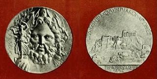
An Olympic medal is awarded to successful competitors at one of the Olympic Games. There are three classes of medal to be won: gold, silver, and bronze, awarded to first, second, and third place, respectively. The granting of awards is laid out in detail in the Olympic protocols.
The International Olympic Committee (IOC) uses icons, flags, and symbols to elevate the Olympic Games. These symbols include those commonly used during Olympic competition—such as the flame, fanfare and theme—as well as those used throughout the years, such as the Olympic flag.
An Olympic Village is a residential complex built or reassigned for the Olympic Games in or nearby the host city for the purpose of accommodating all of the delegations. Olympic Villages are usually located close to the Olympic Stadium within an Olympic Park.
The 2020 Summer Olympics, officially the Games of the XXXII Olympiad and officially branded as Tokyo 2020, were an international multi-sport event held from 23 July to 8 August 2021 in Tokyo, Japan, with some preliminary events that began on 21 July 2021. Tokyo was selected as the host city during the 125th IOC Session in Buenos Aires, Argentina on 7 September 2013.
Andrea Mead Lawrence was an American alpine ski racer and environmentalist. She competed in three Winter Olympics and one additional World Championship, and was the first American alpine skier to win two Olympic gold medals.
The Paralympic symbols are the icons, flags, and symbols used by the International Paralympic Committee to promote the Paralympic Games.
The Olympic Games ceremonies of the ancient Olympic Games were an integral part of the games; modern Olympic Games have opening, closing, and medal ceremonies. Some of the elements of the modern ceremonies date back to the ancient games from which the modern Olympics draw their ancestry. An example of this is the prominence of Greece in both the opening and closing ceremonies. During the 2004 Summer Olympics, the medal winners received a crown of olive branches, which was a direct reference to the ancient games, in which the victor's prize was an olive wreath. The various elements of ceremonies are mandated by the Olympic Charter, and cannot be changed by the host nation. Host nations are required to seek the approval of the International Olympic Committee (IOC) for ceremony elements, including the artistic portions of the opening and closing ceremonies.
The 2020 Summer Paralympics, branded as the Tokyo 2020 Paralympic Games, were an international multi-sport parasports event held from 24 August to 5 September 2021 in Tokyo, Japan. They were the 16th Summer Paralympic Games as organized by the International Paralympic Committee (IPC).
The 2012 Summer Olympics and Paralympics cauldron was used for the Olympic flame during the Summer Olympics and Paralympics of London 2012. The cauldron was designed by Thomas Heatherwick and described as "one of the best-kept secrets of the opening ceremony": until it was lit during the Olympics ceremony, neither its design and location, nor who would light it, had been revealed. For the Olympics it consisted of 204 individual 'petals', and for the Paralympics 164, one for each competing nation.
Miraitowa is the official mascot of the 2020 Summer Olympics, and Someity is the official mascot of the 2020 Summer Paralympics. The events were held in Tokyo, Japan, in 2021. The checkered design on both mascots was inspired by the ichimatsu moyo pattern of the Tokyo 2020 official logo, while Someity's pink design was inspired by cherry blossoms. Both fictional characters have various superpowers, such as teleportation.
The 2020 Summer Paralympics torch relay was held from 12 August 2021 to 24 August 2021. After being lit in multiple locations in Japan and Great Britain, the torch was intended to travel around Japan and end in Tokyo's New National Stadium, the main venue of the 2020 Summer Paralympics. The relay took place on a smaller scale than the Olympic relay, starting in Tokyo, with local flames lighted through Saitama, Chiba and Shizuoka prefectures where events of the games were held. The relay ended at the 2020 Summer Paralympics opening ceremony. The LIXIL Corporation was the presenting partner of the torch relay.
The 1960 Winter Olympics torch relay was held in the leadup to the 1960 Winter Olympics in Squaw Valley, California, in the United States, from January 31 to February 18, 1960. It was the first torch relay in the Americas, although a flame had previously been lit at the 1932 Summer Olympics in Los Angeles. For the final time, the Olympic flame was not lit in the Greek city of Olympia. The relay instead began in Morgedal, Norway, as had been done for the first Winter Olympics torch relay in 1952.