
Palatino is the name of an old-style serif typeface designed by Hermann Zapf, initially released in 1949 by the Stempel foundry and later by other companies, most notably the Mergenthaler Linotype Company.

In typography and lettering, a sans-serif, sans serif, gothic, or simply sans letterform is one that does not have extending features called "serifs" at the end of strokes. Sans-serif fonts tend to have less stroke width variation than serif fonts. They are often used to convey simplicity and modernity or minimalism.

A typeface is the overall design of lettering; the design can include variations, such as extra bold, bold, regular, light, italic, condensed, extended, etc. Each of these variations of the typeface is a font.

Frutiger is a series of typefaces named after its Swiss designer, Adrian Frutiger. Frutiger is a humanist sans-serif typeface, intended to be clear and highly legible at a distance or at small text sizes. A very popular design worldwide, type designer Steve Matteson described its structure as "the best choice for legibility in pretty much any situation" at small text sizes, while Erik Spiekermann named it as "the best general typeface ever".
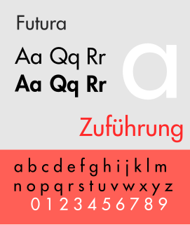
Futura is a geometric sans-serif typeface designed by Paul Renner and released in 1927. It was designed as a contribution on the New Frankfurt-project. It is based on geometric shapes, especially the circle, similar in spirit to the Bauhaus design style of the period. It was developed as a typeface by the Bauer Type Foundry, in competition with Ludwig & Mayer's seminal Erbar typeface of 1926.
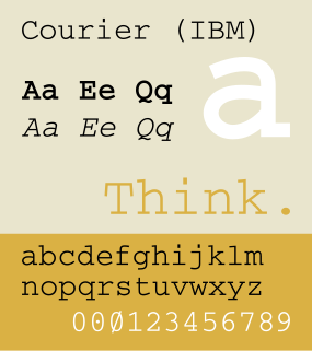
Courier is a monospaced slab serif typeface. The typeface was designed by Howard "Bud" Kettler (1919–1999). Initially created for IBM's typewriters, it has been adapted to use as a computer font and versions of it are installed on most desktop computers.
William Addison Dwiggins, was an American type designer, calligrapher, and book designer. He attained prominence as an illustrator and commercial artist, and he brought to the designing of type and books some of the boldness that he displayed in his advertising work. His work can be described as ornamented and geometric, similar to the Art Moderne and Art Deco styles of the period, using Oriental influences and breaking from the more antiquarian styles of his colleagues and mentors Updike, Cleland and Goudy.

Johnston is a sans-serif typeface designed by and named after Edward Johnston. The typeface was commissioned in 1913 by Frank Pick, commercial manager of the Underground Electric Railways Company of London, as part of his plan to strengthen the company's corporate identity. Johnston was originally created for printing, but it rapidly became used for the enamel station signs of the Underground system as well.

Junicode ("Junius-Unicode") is a free old-style serif typeface developed by Peter S. Baker of the University of Virginia. The design is based on a 17th-century typeface used in Oxford, England.

In typography, the x-height, or corpus size, is the distance between the baseline and the mean line of lower-case letters in a typeface. Typically, this is the height of the letter x in the font, as well as the letters v, w, and z. One of the most important dimensions of a font, x-height is used to define how high lower-case letters are compared to upper-case letters.

Braggadocio is a geometrically constructed sans-serif stencil typeface designed by W.A. Woolley in 1930 for the Monotype Corporation. The design was based on Futura Black.
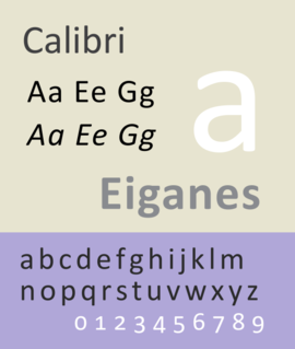
Calibri is a sans-serif typeface family designed by Luc(as) de Groot in 2002–2004 and released to the general public in 2007, with Microsoft Office 2007 and Windows Vista. In Office 2007, it replaced Times New Roman as the default typeface in Word and replaced Arial as the default in PowerPoint, Excel, Outlook, and WordPad. De Groot described its subtly rounded design as having "a warm and soft character".

Westminster is a printing and display typeface inspired by the machine-readable numbers printed on cheques and designed by Leo Maggs.
Gaelic type is a family of Insular script typefaces devised for printing Classical Gaelic. It was widely used from the 16th until the mid-18th century (Scotland) or the mid-20th century (Ireland) but is now rarely used. Sometimes, all Gaelic typefaces are called Celtic or uncial although most Gaelic types are not uncials. The "Anglo-Saxon" types of the 17th century are included in this category because both the Anglo-Saxon types and the Gaelic/Irish types derive from the insular manuscript hand.
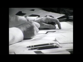
In metal typesetting, a font was a particular size, weight and style of a typeface. Each font was a matched set of type, one piece for each glyph, and a typeface consisting of a range of fonts that shared an overall design.

DIN 1451 is a sans-serif typeface that is widely used for traffic, administrative and technical applications.

A subscript or superscript is a character that is set slightly below or above the normal line of type, respectively. It is usually smaller than the rest of the text. Subscripts appear at or below the baseline, while superscripts are above. Subscripts and superscripts are perhaps most often used in formulas, mathematical expressions, and specifications of chemical compounds and isotopes, but have many other uses as well.

Yale is an old style serif typeface designed by Matthew Carter and first released in 2004. It was commissioned by Yale University for use in all of its signage, promotional and internal material.

Source Han Serif, also known as Noto Serif CJK is a serif Song/Ming typeface created by Adobe and Google.

Iosevka is a monospace programming typeface, built declaratively using custom typeface generation software, and with an emphasis on compatibility with CJK characters. It is available under a FOSS license. The default builds are available in two styles of seven weights each, and come with italic and oblique versions. The typeface was designed, however, to be easily configurable by editing textual TOML configuration files in the custom generation software.


