Rose | |
---|---|
Color coordinates | |
Hex triplet | #FF0080 |
sRGB B (r, g, b) | (255, 0, 128) |
HSV (h, s, v) | (330°, 100%, 100%) |
CIELChuv (L, C, h) | (55, 143, 355°) |
Source | By definition [1] |
ISCC–NBS descriptor | Vivid purplish red |
B: Normalized to [0–255] (byte) H: Normalized to [0–100] (hundred) |
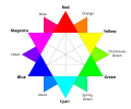
Rose is the color halfway between red and magenta on the HSV color wheel, also known as the RGB color wheel, on which it is at hue angle of 330 degrees.
Rose is one of the tertiary colors on the HSV (RGB) color wheel. The complementary color of rose is spring green. Sometimes rose is quoted instead as the web-safe color FF00CC, which is closer to magenta than to red, corresponding to a hue angle near 320 degrees, or the web-safe color FF0077, which is closer to red than magenta, corresponding to a hue angle of about 340 degrees.
The first recorded use of rose as a color name in English was in 1382. [2]
The etymology of the color name rose is the same as that of the name of the rose flower. The name originates from Latin rosa, borrowed through Oscan from colonial Greek in southern Italy: rhodon (Aeolic form: wrodon), from Aramaic wurrdā, from Assyrian wurtinnu, from Old Iranian *warda (cf. Avestan warda, Sogdian ward, Parthian wâr).
Magenta is a purplish-red color. On color wheels of the RGB (additive) and CMY (subtractive) color models, it is located precisely midway between blue and red. It is one of the four colors of ink used in color printing by an inkjet printer, along with yellow, cyan, and black to make all the other colors. The tone of magenta used in printing, printer's magenta, is redder than the magenta of the RGB (additive) model, the former being closer to rose.
Lavender is a light shade of purple or violet. It applies particularly to the color of the flower of the same name. The web color called lavender is displayed adjacent—it matches the color of the palest part of the flower; however, the more saturated color shown as floral lavender more closely matches the average color of the lavender flower as shown in the picture and is the tone of lavender historically and traditionally considered lavender by average people as opposed to website designers. The color lavender might be described as a medium purple, a pale bluish purple, or a light pinkish-purple. The term lavender may be used in general to apply to a wide range of pale, light, or grayish-purples, but only on the blue side; lilac is pale purple on the pink side. In paints, the color lavender is made by mixing purple and white paint.
Copper is a reddish brown color that resembles the metal copper.
A spectral color is a color that is evoked by monochromatic light, i.e. either a spectral line with a single wavelength or frequency of light in the visible spectrum, or a relatively narrow spectral band. Every wave of visible light is perceived as a spectral color; when viewed as a continuous spectrum, these colors are seen as the familiar rainbow. Non-spectral colors are evoked by a combination of spectral colors.
Lilac is a light shade of pink representing the average color of most lilac flowers. The colors of some lilac flowers may be equivalent to the colors shown below as pale lilac, rich lilac, or deep lilac. However, there are other lilac flowers that are colored red-violet.
Red-violet refers to a rich color of high medium saturation about 3/4 of the way between red and magenta, closer to magenta than to red. In American English, this color term is sometimes used in color theory as one of the purple colors—a non-spectral color between red and violet that is a deep version of a color on the line of purples on the CIE chromaticity diagram.
Burgundy is a purplish red.
Spring green is a color that was traditionally considered to be on the yellow side of green, but in modern computer systems based on the RGB color model is halfway between cyan and green on the color wheel.
In optics, orange has a wavelength between approximately 585 and 620 nm and a hue of 30° in HSV color space. In the RGB color space it is a secondary color numerically halfway between gamma-compressed red and yellow, as can be seen in the RGB color wheel. The complementary color of orange is azure. Orange pigments are largely in the ochre or cadmium families, and absorb mostly blue light.
Varieties of the color green may differ in hue, chroma or lightness, or in two or three of these qualities. Variations in value are also called tints and shades, a tint being a green or other hue mixed with white, a shade being mixed with black. A large selection of these various colors is shown below.
Varieties of the color red may differ in hue, chroma, lightness, or in two or three of these qualities. Variations in value are also called tints and shades, a tint being a red or other hue mixed with white, a shade being mixed with black. A large selection of these various colors are shown below.
The color magenta has notable tints and shades. These various colors are shown below.
The color Byzantium is a particular dark tone of purple. It originates in modern times, and, despite its name, it should not be confused with Tyrian purple, the color historically used by Roman and Byzantine emperors. The latter, often also referred to as "Tyrian red", is more reddish in hue, and is in fact often depicted as closer to crimson than purple. The first recorded use of byzantium as a color name in English was in 1926.
Varieties of the color yellow may differ in hue, chroma or lightness, or in two or three of these qualities. Variations in value are also called tints and shades, a tint being a yellow or other hue mixed with white, a shade being mixed with black. A large selection of these various colors is shown below.
The ISCC–NBS System of Color Designation is a system for naming colors based on a set of 13 basic color terms and a small set of adjective modifiers. It was first established in the 1930s by a joint effort of the Inter-Society Color Council (ISCC), made up of delegates from various American trade organizations, and the National Bureau of Standards (NBS), a US government agency. As suggested in 1932 by the first chairman of the ISCC, the system's goal is to be "a means of designating colors in the United States Pharmacopoeia, in the National Formulary, and in general literature ... such designation to be sufficiently standardized as to be acceptable and usable by science, sufficiently broad to be appreciated and used by science, art, and industry, and sufficiently commonplace to be understood, at least in a general way, by the whole public." The system aims to provide a basis on which color definitions in fields from fashion and printing to botany and geology can be systematized and regularized, so that each industry need not invent its own incompatible color system.
Varieties of the color blue may differ in hue, chroma, or lightness, or in two or three of these qualities. Variations in value are also called tints and shades, a tint being a blue or other hue mixed with white, a shade being mixed with black. A large selection of these colors is shown below.
Variations of gray or grey include achromatic grayscale shades, which lie exactly between white and black, and nearby colors with low colorfulness. A selection of a number of these various colors is shown below.
Violet is a color term derived from the flower of the same name. There are numerous variations of the color violet, a sampling of which are shown below.
There are numerous variations of the color purple, a sampling of which is shown below.
Rose is the color halfway between red and magenta on the HSV color wheel, also known as the RGB color wheel.