A contemporary definition of calligraphic practice is "the art of giving form to signs in an expressive, harmonious and skillful manner."[1] The story of writing is one of aesthetic development framed within the technical skills, transmission speed(s) and material limitations of a person, time and place.[2]
A style of writing is described as a script, hand or alphabet.[3]
Calligraphy ranges from functional hand-lettered inscriptions and designs to fine art pieces where the abstract expression of the handwritten mark may or may not supersede the legibility of the letters.[4] Classical calligraphy differs from typography and non-classical hand-lettering, though a calligrapher may create all of these; characters are historically disciplined yet fluid and spontaneous, improvised at the moment of writing.[5]
Calligraphic writing continued to play a role long after the introduction of the printing press in the West, official documents being drawn up in engrossed or handwritten form well into the 18th century. A revival of calligraphy in the late 19th century was associated with the Art Nouveau and Arts and Crafts movements, and it continues to be practiced, typically commissioned for private purposes such as wedding invitations, logo design, memorial documents, etc.[6]
Codex multorum librorum est; liber unius voluminis. Et dictus codex per translationem a codicibus arborum seu vitium, quasi caudex, quod ex se multitudinem librorum quasi ramorum contineat.
"A codex is composed of many books; a book is of one scroll. It is called codex by way of metaphor from the trunks of trees or vines, as if it were a wooden stock (caudex), because it contains in itself a multitude of books, as it were of branches."
A tradition of biblical manuscripts in codex form goes back to the 2nd century (Codex Vaticanus), and from about the 5th century, two distinct styles of writing known as uncial and half-uncial (from the Latin uncia, or 'inch') developed from various Roman bookhands.[8]
Charlemagne's devotion to improved scholarship resulted in the recruiting of "a crowd of scribes", according to Alcuin, the Abbot of York.[10] Alcuin developed the style known as the Caroline or Carolingian minuscule. The first manuscript in this hand was the Godescalc Evangelistary (finished 783) — a Gospel book written by the scribe Godescalc.[11] Carolingian remains the one progenitor hand from which modern booktype descends.[12]
Blackletter (also known as Gothic) and its variation Rotunda, gradually developed from the Carolingian hand during the 12th century. Over the next three centuries, the scribes in northern Europe used an ever more compressed and spiky form of Gothic. Those in Italy and Spain preferred the rounder but still heavy-looking Rotunda. During the 15th century, Italian scribes returned to the Roman and Carolingian models of writing and designed the Italic hand, also called Chancery cursive, and Roman bookhand. These three hands — Gothic, Italic, and Roman bookhand — became the models for printed letters. Johannes Gutenberg used Gothic to print his famous Bible, but the lighter-weight Italic and Roman bookhand have since become the standard.
During the Middle Ages, hundreds of thousands of manuscripts were produced:[13] some illuminated with gold and fine painting, some illustrated with line drawings, and some just textbooks.[14]
Towards the end of the Middle Ages, administration in the states of Western Europe became more centralised. Paper was again widely available in Europe, which allowed a bureaucracy with standardized bookkeeping. In late medieval England, this led to the development of the Chancery Standard of Late Middle English, along with new forms of standardised calligraphy used for the production of legal or official documents. By the mid-15th century, Chancery Standard was used for most official purposes except by the Church, which still used Latin, and for some legal purposes, for which Law French and some Latin were used. It was disseminated around England by bureaucrats on official business and slowly gained prestige. The production of finalized, calligraphic copies of documents in Chancery hand came to be known as "engrossing", from Anglo-Frenchengrosser (Old Frenchen gros 'in large (letters)').
In the late 1490s and early 1500s, the English bookprinting engineer Richard Pynson favored Chancery Standard in his published works, and consequently pushed the English spelling further towards standardization.
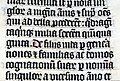
Page of initials from Stephanus Hayn's notebook (1775)
In the mid-1600s French officials, flooded with documents written in various hands and varied levels of skill, complained that many such documents were beyond their ability to decipher. The Office of the Financier thereupon restricted all legal documents to three hands, namely the coulée, the rhonde (known as Round hand in English) and a Speed Hand sometimes simply called the bastarda.[15]
While there were many great French masters at the time, the most influential in proposing these hands was Louis Barbard, who published Les Ecritures Financière et Italienne Bastarde dans Leur Naturel circa 1650.[15]
With the destruction of the Camera Apostolica during the sack of Rome (1527), the capitol for writing masters moved to Southern France. By 1600, the Italic Cursiva began to be replaced by a technological refinement, the Italic Chancery Circumflessa, which in turn fathered the Rhonde and later English Roundhand.[15]
In England, Ayres and Banson popularized the Round Hand while Snell is noted for his reaction to them, and warnings of restraint and proportionality. Still, Edward Crocker began publishing his copybooks 40 years before the aforementioned.[15]
Modern revival
Edward Johnston, founder of modern calligraphy, at work in 1902.
After printing became ubiquitous from the 15th century, the production of illuminated manuscripts began to decline.[16] However, the rise of printing did not mean the end of calligraphy.[17]
This triggered Johnston's interest in the art of calligraphy with the use of a broad edged pen. He began a teaching course in calligraphy at the Central School in Southampton Row, London from September 1899, where he influenced the typeface designer and sculptor Eric Gill. He was commissioned by Frank Pick to design a new typeface for London Underground, still used today (with minor modifications).[22]
He has been credited for reviving the art of modern penmanship and lettering single-handedly through his books and teachings - his handbook on the subject, Writing & Illuminating, & Lettering (1906) was particularly influential on a generation of British typographers and calligraphers, including Graily Hewitt, Stanley Morison, Eric Gill, Alfred Fairbank and Anna Simons. Johnston also devised the simply crafted round calligraphic handwriting style, written with a broad pen, known today as the Foundational hand, although Johnston never used the terms "Foundational" or "Foundational Hand". Johnston initially taught his students an uncial hand using a flat pen angle, but later taught his hand using a slanted pen angle.[23] He first referred to this hand as "Foundational Hand" in his 1909 publication, Manuscript & Inscription Letters for Schools and Classes and for the Use of Craftsmen.[24]
20th century
Graily Hewitt taught at the Central School of Arts and Crafts and published together with Johnston throughout the early part of the century. Hewitt was central to the revival of gilding in calligraphy, and his prolific output on type design also appeared between 1915 and 1943. He is attributed with the revival of gilding with gesso and gold leaf on vellum. Hewitt helped to found the Society of Scribes & Illuminators (SSI) in 1921, probably the world's foremost calligraphy society.
Hewitt is not without both critics[25] and supporters[26] in his rendering of Cennino Cennini's medieval gesso recipes.[27]Donald Jackson, a British calligrapher, has sourced his gesso recipes from earlier centuries a number of which are not presently in English translation.[28] Graily Hewitt created the patent announcing the award to Prince Philip of the title of Duke of Edinburgh on November 19, 1947, the day before his marriage to Queen Elizabeth.[29]
Johnston's pupil, Anna Simons, was instrumental in sparking interest in calligraphy in Germany with her German translation of Writing, Illuminating, and Lettering in 1910.[18] Austrian typographer Rudolf Larisch, who taught lettering at the Vienna School of Art, published six influential books on the subject that shaped the work of many German-speaking calligraphers. Since Gothic script remained in use in printing across German-speaking countries, it continued to exert a strong influence on their calligraphic styles.
Rudolf Koch was a friend and younger contemporary of Larisch. Koch's books, type designs, and teaching made him one of the most influential calligraphers of the 20th century in northern Europe and later in the U.S. Larisch and Koch taught and inspired many European calligraphers, notably Karlgeorg Hoefer, and Hermann Zapf.[30]
Modern calligraphy
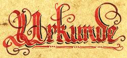
Modern Western calligraphy (Denis Brown, 2006)Calligraphy of the German word Urkunde ('deed, certificate'; Manuel Strehl, 2004)
Calligraphy today finds diverse applications. These include graphic design, logo design, type design, paintings, scholarship, maps, menus, greeting cards, invitations, legal documents, diplomas, cut stone inscriptions, memorial documents, props and moving images for film and television, business cards, and handmade presentations. Many calligraphers make their livelihood in the addressing of envelopes and invitations for public and private events, including wedding stationery. Entry points exist for both children and adults via classes and instructional books.
The scope of the calligraphic art is more than pure antiquarian interest.[31] Johnston's legacy remains pivotal to the ambitions of perhaps most Western calligraphers:
It is possible even now to go back to the child's - something like the early calligrapher's - point of view, and this is the only healthy one for any fine beginning: to this nothing can be added; all Rules must give way to Truth and Freedom.[32]
The multimillion-dollar Saint John's Bible project for the 21st century, completed in 2011, had engaged Donald Jackson with an international scriptorium. It is designed to be a 21st-century illuminated Bible, executed with both ancient and modern tools and techniques. The earlier 20th-century "Bulley Bible" was executed by a student of Edward Johnston's, Edward Bulley.[33]
The digital era has facilitated the creation and dissemination of thousands of new and historically styled fonts. Calligraphy gives unique expression to every individual letterform within a design layout which is not the strength of typeface technologies no matter their sophistication.[34] The usefulness of the digital medium to the calligrapher is not limited to the computer layout of the new Saint John's Bible prior to working by hand.[35] Graphics tablets facilitate calligraphic design work more than large size art pieces.[36] The internet supports a number of online communities of calligraphers and hand lettering artists.
Other sub-styles
Other Western sub-styles and their respective century of appearance:
Alexander, J.J.G., Marrow, J.H., & Sandler, L.F. with Moodey, E., & Petev, T.T. (2005) The Splendor of the Word: Medieval and Renaissance Illuminated Manuscripts at the New York Public Library. New York Public Library/ Harvey Miller Publishers
Backhouse, J. (1981) The Lindisfarne Gospels. Phaidon Press
Baines, P., & Dixon, C. (2003) Signs: lettering in the environment. Lawrence King Publishing
Bickham, G. (1743) The Universal Penman London. 1954 edn Dover, New York
Bloem, M., & Browne, M. (2002) Colin McCahon: A Question of Faith. Craig Potton Publishing
British Library (2007). Collect Britain. Retrieved 22 February 2007.
Brown, M.P. & Lovett, P. (1999) The Historical Source Book for Scribes. British Library
Calderhead, C. (2005) Illuminating the Word: The Making of the Saint John's Bible. Liturgical Press
Johnston, E. (1909) Manuscript & Inscription Letters: For schools and classes and for the use of craftsmen, plate 6. San Vito Press & Double Elephant Press, 10th Impression
Kapr, A. (1991) "Calligraphy 91" in Schreibwerkstaat Klingspor Offenbach
Kerr, D.J. (2006) Amassing Treasures for All Times: Sir George Grey, Colonial Bookman and Collector. University of Otago Press/Oak Knoll Press
Knight, S. (1998) Historical Scripts: From Classical Times to the Renaissance. Oak Knoll Press
Knight, S. "The Roman Alphabet" in The World's Writing Systems (supra), pp.312–32.
↑Knight, Stan (1998). Historical scripts: from Classical Times to the Renaissance (2nd Correcteded.). New Castle, Del: Oak Knoll Press. pp.9–10. ISBN9781884718564.
↑Trinity College Library Dublin 2006; Walther & Wolf 2005; Brown & Lovett 1999: 40; Backhouse 1981
This page is based on this Wikipedia article Text is available under the CC BY-SA 4.0 license; additional terms may apply. Images, videos and audio are available under their respective licenses.