
A chart is a graphical representation for data visualization, in which "the data is represented by symbols, such as bars in a bar chart, lines in a line chart, or slices in a pie chart". A chart can represent tabular numeric data, functions or some kinds of quality structure and provides different info.

SPSS Statistics is a statistical software suite developed by IBM for data management, advanced analytics, multivariate analysis, business intelligence, and criminal investigation. Long produced by SPSS Inc., it was acquired by IBM in 2009. Versions of the software released since 2015 have the brand name IBM SPSS Statistics.
In statistics, exploratory data analysis (EDA) is an approach of analyzing data sets to summarize their main characteristics, often using statistical graphics and other data visualization methods. A statistical model can be used or not, but primarily EDA is for seeing what the data can tell beyond the formal modeling and thereby contrasts with traditional hypothesis testing, in which a model is supposed to be selected before the data is seen. Exploratory data analysis has been promoted by John Tukey since 1970 to encourage statisticians to explore the data, and possibly formulate hypotheses that could lead to new data collection and experiments. EDA is different from initial data analysis (IDA), which focuses more narrowly on checking assumptions required for model fitting and hypothesis testing, and handling missing values and making transformations of variables as needed. EDA encompasses IDA.

Infographics are graphic visual representations of information, data, or knowledge intended to present information quickly and clearly. They can improve cognition by using graphics to enhance the human visual system's ability to see patterns and trends. Similar pursuits are information visualization, data visualization, statistical graphics, information design, or information architecture. Infographics have evolved in recent years to be for mass communication, and thus are designed with fewer assumptions about the readers' knowledge base than other types of visualizations. Isotypes are an early example of infographics conveying information quickly and easily to the masses.

Stata is a general-purpose statistical software package developed by StataCorp for data manipulation, visualization, statistics, and automated reporting. It is used by researchers in many fields, including biomedicine, economics, epidemiology, and sociology.
GRIB is a concise data format commonly used in meteorology to store historical and forecast weather data. It is standardized by the World Meteorological Organization's Commission for Basic Systems, known under number GRIB FM 92-IX, described in WMO Manual on Codes No.306. Currently there are three versions of GRIB. Version 0 was used to a limited extent by projects such as TOGA, and is no longer in operational use. The first edition is used operationally worldwide by most meteorological centers, for Numerical Weather Prediction output (NWP). A newer generation has been introduced, known as GRIB second edition, and data is slowly changing over to this format. Some of the second-generation GRIB is used for derived products distributed in the Eumetcast of Meteosat Second Generation. Another example is the NAM model.
JMP is a suite of computer programs for statistical analysis and machine learning developed by JMP, a subsidiary of SAS Institute. The program was launched in 1989 to take advantage of the graphical user interface introduced by the Macintosh operating systems. It has since been significantly rewritten and made available for the Windows operating system.

Data analysis is the process of inspecting, cleansing, transforming, and modeling data with the goal of discovering useful information, informing conclusions, and supporting decision-making. Data analysis has multiple facets and approaches, encompassing diverse techniques under a variety of names, and is used in different business, science, and social science domains. In today's business world, data analysis plays a role in making decisions more scientific and helping businesses operate more effectively.
Statgraphics is a statistics package that performs and explains basic and advanced statistical functions.
Data and information visualization is the practice of designing and creating easy-to-communicate and easy-to-understand graphic or visual representations of a large amount of complex quantitative and qualitative data and information with the help of static, dynamic or interactive visual items. Typically based on data and information collected from a certain domain of expertise, these visualizations are intended for a broader audience to help them visually explore and discover, quickly understand, interpret and gain important insights into otherwise difficult-to-identify structures, relationships, correlations, local and global patterns, trends, variations, constancy, clusters, outliers and unusual groupings within data. When intended for the general public to convey a concise version of known, specific information in a clear and engaging manner, it is typically called information graphics.

A heat map is a 2-dimensional data visualization technique that represents the magnitude of individual values within a dataset as a color. The variation in color may be by hue or intensity.

Hans Rosling was a Swedish physician, academic and public speaker. He was a professor of international health at Karolinska Institute and was the co-founder and chairman of the Gapminder Foundation, which developed the Trendalyzer software system. Widely regarded as one of the most influential physicians and geographers in the modern world, he held presentations around the world, including several TED Talks in which he promoted the use of data to explore development issues. His posthumously published book Factfulness, coauthored with his daughter-in-law Anna Rosling Rönnlund and son Ola Rosling, became an international bestseller.
Statistical graphics, also known as statistical graphical techniques, are graphics used in the field of statistics for data visualization.

A plot is a graphical technique for representing a data set, usually as a graph showing the relationship between two or more variables. The plot can be drawn by hand or by a computer. In the past, sometimes mechanical or electronic plotters were used. Graphs are a visual representation of the relationship between variables, which are very useful for humans who can then quickly derive an understanding which may not have come from lists of values. Given a scale or ruler, graphs can also be used to read off the value of an unknown variable plotted as a function of a known one, but this can also be done with data presented in tabular form. Graphs of functions are used in mathematics, sciences, engineering, technology, finance, and other areas.
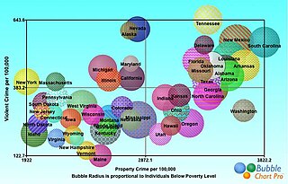
A bubble chart is a type of chart that displays three dimensions of data. Each entity with its triplet (v1, v2, v3) of associated data is plotted as a disk that expresses two of the vi values through the disk's xy location and the third through its size. Bubble charts can facilitate the understanding of social, economical, medical, and other scientific relationships.

A motion chart is a dynamic bubble chart which allows efficient and interactive exploration and visualization of longitudinal multivariate data. Motion charts provide mechanisms for mapping ordinal, nominal and quantitative variables onto time, 2D coordinate axes, size, colors, glyphs and appearance characteristics, which facilitate the interactive display of multidimensional and temporal data.

Google Fusion Tables was a web service provided by Google for data management. Fusion tables was used for gathering, visualising and sharing data tables. Data are stored in multiple tables that Internet users can view and download.

Google Public Data Explorer provides public data and forecasts from a range of international organizations and academic institutions including the World Bank, OECD, Eurostat and the University of Denver. These can be displayed as line graphs, bar graphs, cross-sectional plots or on maps. The product was launched on March 8, 2010 as an experimental visualization tool in Google Labs.
Gapminder Foundation is a non-profit venture registered in Stockholm, Sweden, that promotes sustainable global development and achievement of the United Nations Millennium Development Goals by increased use and understanding of statistics and other information about social, economic, and environmental development at local, national, and global levels.
