


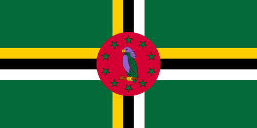
 The flag of Dominica features a sisserou parrot, a national symbol.
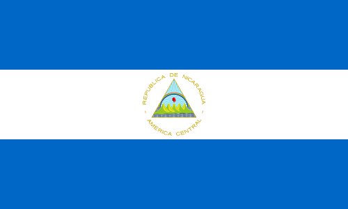 Flag of Nicaragua, although at this size the individual bands of the rainbow are nearly indistinguishable.
 The flag of the suffragettes (United Kingdom). Purple represents loyalty and dignity, white purity and green hope.
 Wiphala emblem. Official variant flag of Bolivia since 2009
    | |
| Spectral coordinates | |
|---|---|
| Wavelength | 380–435 nm |
| Frequency | 790–690 THz |
| | |
| Hex triplet | #8000FF |
| sRGB B (r, g, b) | (128, 0, 255) |
| HSV (h, s, v) | (270°, 100%, 100%) |
| CIELChuv (L, C, h) | (41, 134, 275°) |
| Source | W3C [1] |
| B: Normalized to [0–255] (byte) H: Normalized to [0–100] (hundred) | |
Violet is the color of light at the short wavelength end of the visible spectrum. It is one of the seven colors that Isaac Newton labeled when dividing the spectrum of visible light in 1672. Violet light has a wavelength between approximately 380 and 450 nanometers. [2] The color's name is derived from the Viola genus of flowers. [3] [4]
Contents
- Etymology and definitions
- Relationship to purple
- In science
- Optics
- Chemistry – pigments and dyes
- Zoology
- Botany
- In history and art
- Prehistory and antiquity
- Middle Ages and Renaissance
- 18th and 19th centuries
- In culture
- Popularity
- Royalty and luxury
- Vanity, extravagance and individualism
- Heian period
- New Age
- Religion
- Politics
- Lesbianism
- Flags
- See also
- References
- External links
In the RGB color model used in computer and television screens, violet is produced by mixing red and blue light, with more blue than red. In the RYB color model historically used by painters, violet is created with a combination of red and blue pigments and is located between blue and purple on the color wheel. In the CMYK color model used in printing, violet is created with a combination of magenta and cyan pigments, with more magenta than cyan. On the RGB/CMY(K) color wheel, violet is located between blue and magenta.
Violet is closely associated with purple. In optics, violet is a spectral color (referring to the color of different single wavelengths of light), whereas purple is the color of various combinations of red and blue (or violet) light, [5] [6] some of which humans perceive as similar to violet. In common usage, both terms are used to refer to a variety of colors between blue and red in hue. [7] [8] [9]
Violet has a long history of association with royalty, originally because Tyrian purple dye was extremely expensive in antiquity. [10] The emperors of Rome wore purple togas, as did the Byzantine emperors. At one point in history, purple bells were also used in the flag of the Sassanid Empire. During the Middle Ages, violet was worn by bishops and university professors and was often used in art as the color of the robes of the Virgin Mary. [11] In Chinese painting, the color violet represents the "unity transcending the duality of Yin and yang" and "the ultimate harmony of the universe". [12] In New Age thinking, purple and/or violet is associated with the crown chakra. [13] One European study suggests that violet is the color people most often associate with extravagance, individualism, vanity and ambiguity [14]